The New Yorker
The New Yorker reimagined to engage a younger reading audience while preserving its iconic charm held dear to its loyal readers.
TYPE
Class project
MY ROLES
UX Researcher
Interaction & Visual Designer
Illustrator
OUTPUTS
Digital & Editorial Design
TEAM
Individual
METHODS
UX Research & Design
TIME
1 Month
Background research revealed to me that The New Yorker Magazine is primarily circulated in the top 10 metropolitan cities in the US and readers are, on average, 47 years of age. However, the average age of New Yorker readers is increasing, further narrowing the audience pool. How can I reimagine the New Yorker’s offerings so that it tailors to a younger audience while preserving the timelessness its current reader base admires?
According to the New Yorker’s Creative Director, Nicholas Blechman, the New Yorker’s consistent design is a hallmark of its identity.
However, broadening the New Yorker's reading audience by engaging younger readers will likely require changes in how its content is interacted with. Moreover, it will need to be done in a manner that preserves the New Yorker’s timeless identity.
I re-imagined the New Yorker IOS application to meet the reading needs of both younger and current reading audiences. The re-envisioned application prioritizes social connections with content and personalization for younger readers. It prioritizes timeless reading experiences for the current reading base, which averages 47 years of age and older.
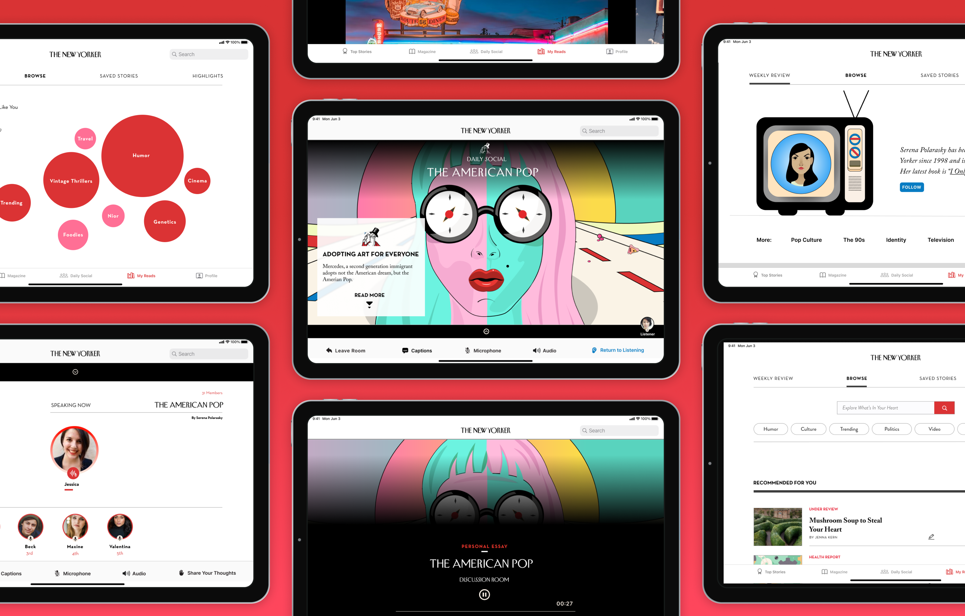
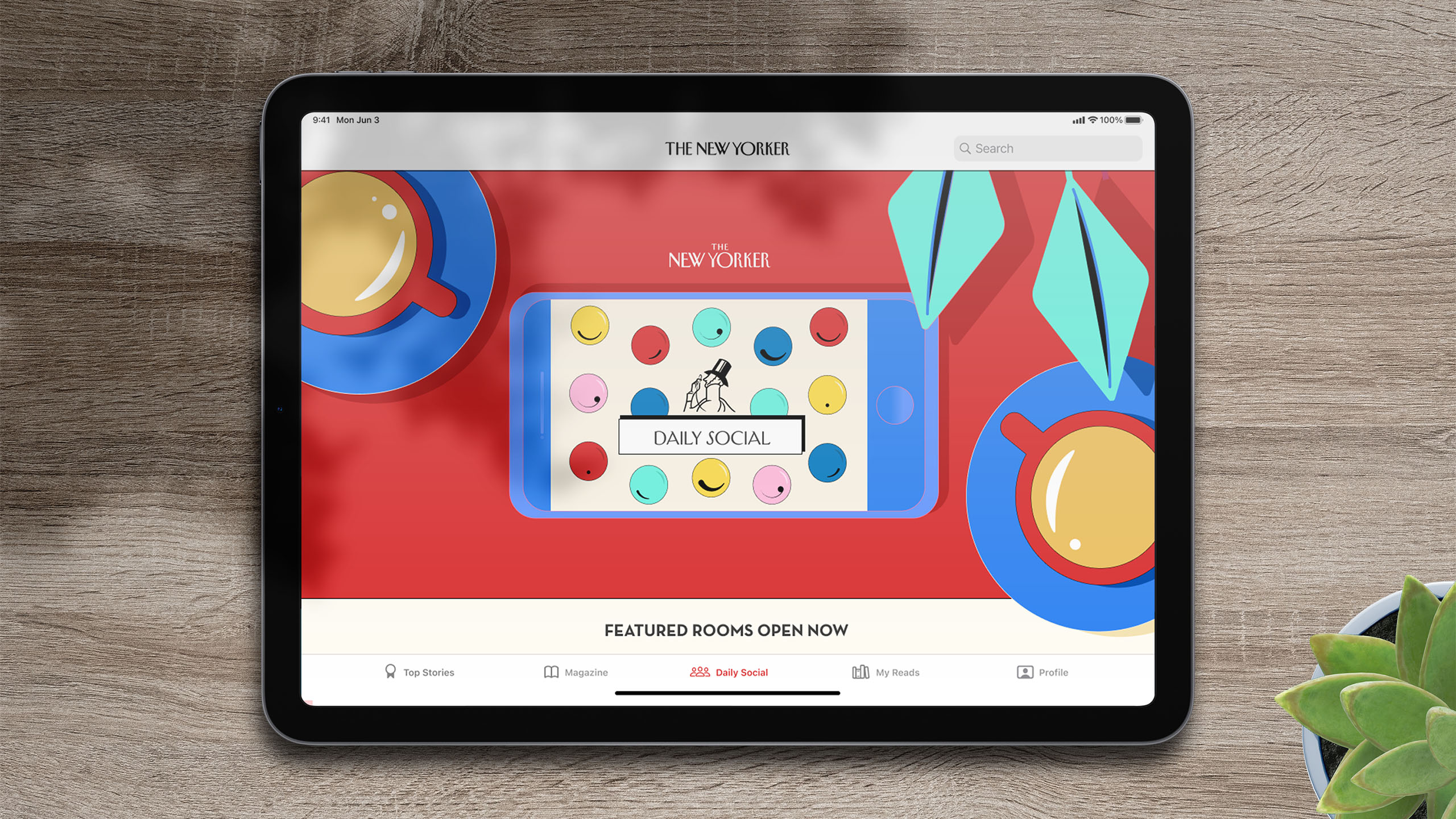
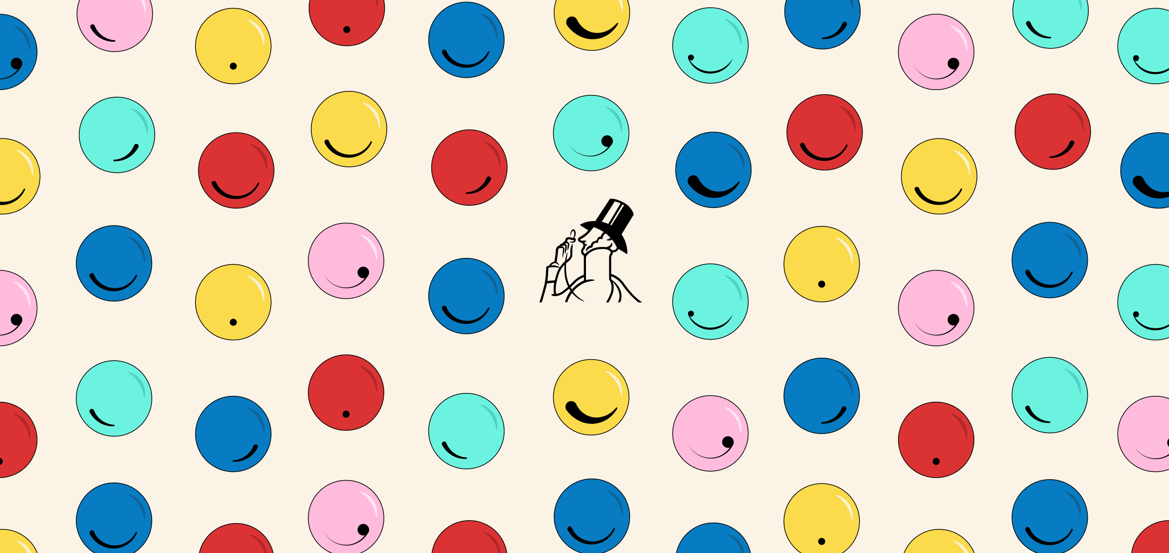
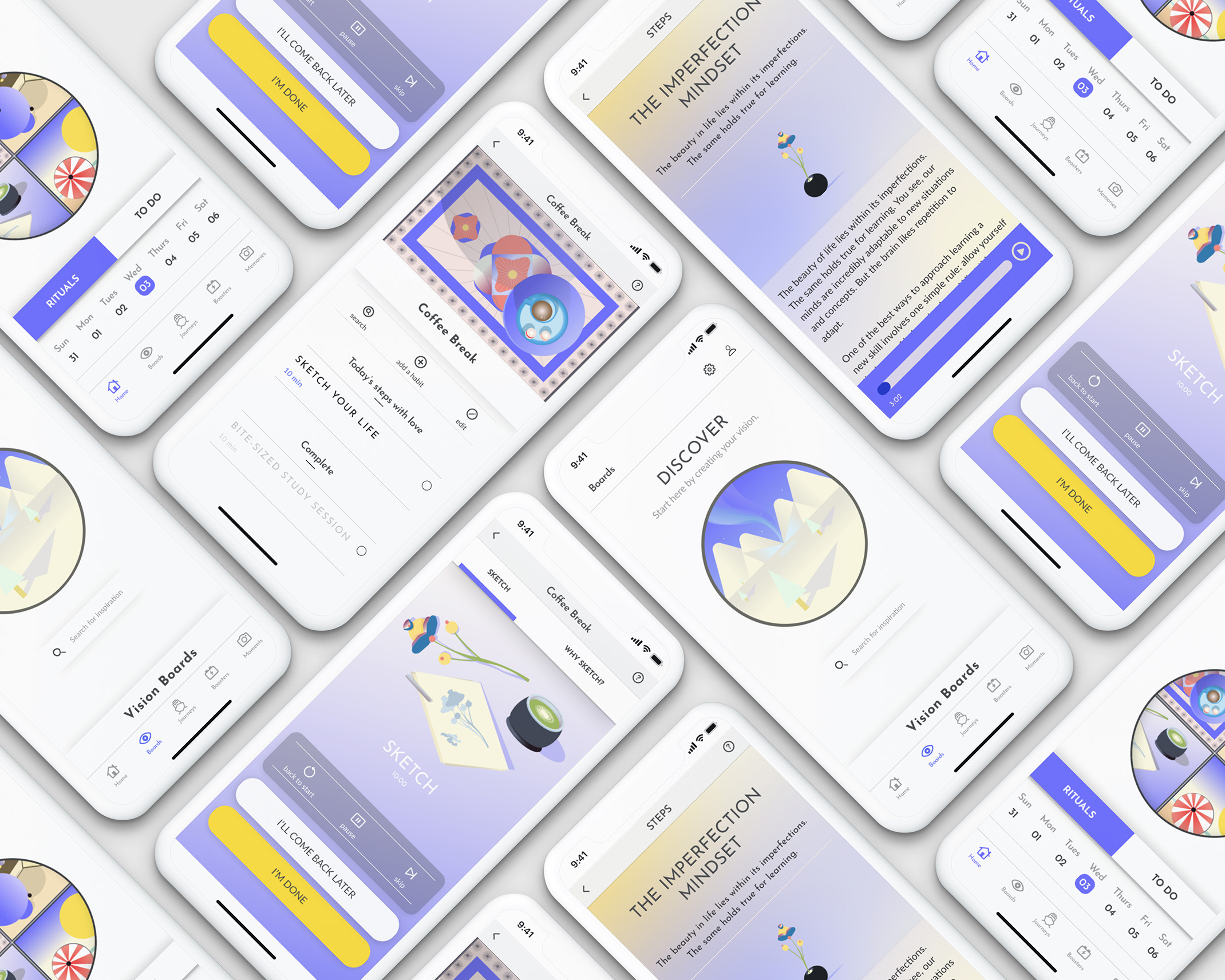
The Daily Social
The Daily Social is a new feature design that connects readers to each other and provides a new way to engage in content - through live conversations.
The Daily Social Discussion Rooms - Hover, tap or click for video controls.
The Daily Social offers the ability to preview conversations, attend discussions to simply learn through listening, or interact with readers and contributors -the most valued assets of the New Yorker.
The Daily Social Discussion Rooms Part Two - Hover, tap or click for video controls.
Key interactive design decisions include a first come first serve discussion queue for more democratic and organized discussions. Horizontal panels allow readers to peruse the discussed content simultaneously in a traditional experience. Yet, their avatar and a sticky bottom navigation ensure they will not will sight or control of how they experience the conversation.
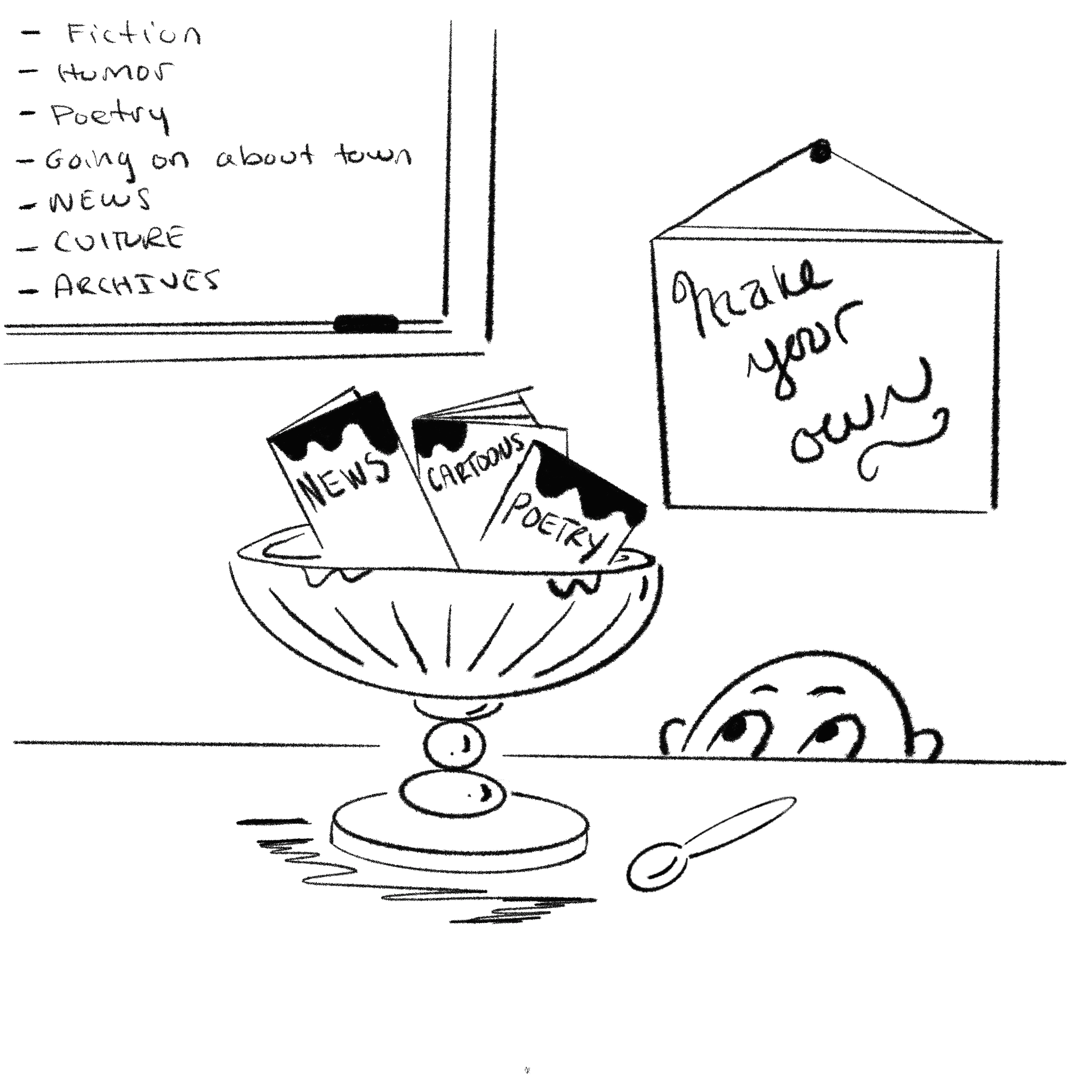
My Reads
My Reads is a feature design that offers readers a dynamic way to search and save content. More so, it provides a weekly review for readers to recognize their interests and connect with like-minded readers and contributors.
My Reads Search - Hover, tap or click for video controls.
The My Reads Weekly Review section is meant to inform and delight with playful visualizations that mimic the subtle idiosyncrasies of the New Yorker’s personality. The My Reads Browse page uses minimal, clean, and conventional design patterns for quick information delivery.
My Reads Weekly Review - Hover, tap or click for video controls.
Timeless Reading
And very importantly, compelling visual storytelling coupled with enough white space keeps the digital reading experience, traditionally, the New Yorker.
Article Reading in Discussion Room - Hover, tap or click for video controls.
The Data & Decisions
The Editoral Needs
of Young, Busy Readers
To understand what makes younger readers loyal, I set out to conduct initial research around their general magazine reading habits and motivations. The most significant findings for readers between 18-35 years of age were preferences for crowd-powered content and flash reading.

Diving into more personal stories helped me recognize the needs younger readers generally want fulfilled from functional, emotional, and motivational standpoints. They are:
01
I read to stay on top of topics important to me.
Many participants noted that they are niche readers and choose certain magazines based on their particular content.
02
I read to be connected to a community I admire.
Reading has become a social artform for younger readers. Participants expect connection and conversation. Whether it’s through comments, tweets, instagram posts. Participants mentioned that what they read is influenced by the community they are in.
03
I read to unwind when I take micro-breaks.
Participants generally read intermittently throughout the day. This is usually between study or work breaks or when commuting. People desire to read quickly and easily but have the ability to read more thoroughly when they choose.
04
I expect the right content to find me.
Participants suggested that they are more likely to interact with media content if it infiltrates their own lives. With the prevalence of machine learning integrated into digital experiences, people often expect sites to bring their preferred content to them without in-depth searching.
05
I read what is beautiful, interesting, interactive, and seamless.
Participants mentioned they are driven by what is interesting, interactive and visually beautiful. Particularly when reading quickly and at intermittent times, the interactive and visual appeal helps them focus on what they want to read in that short time.
Audit & Task Analysis
During my audit, I found that personalization features are lacking and niche reading is difficult for new readers due to the eccentricity of the New Yorker’s content labels and minimal filtering functions in the search section. The New Yorker remains a traditional magazine even in a digital context. Users have the opportunity to save or share content but interactions with others beyond this is limited.
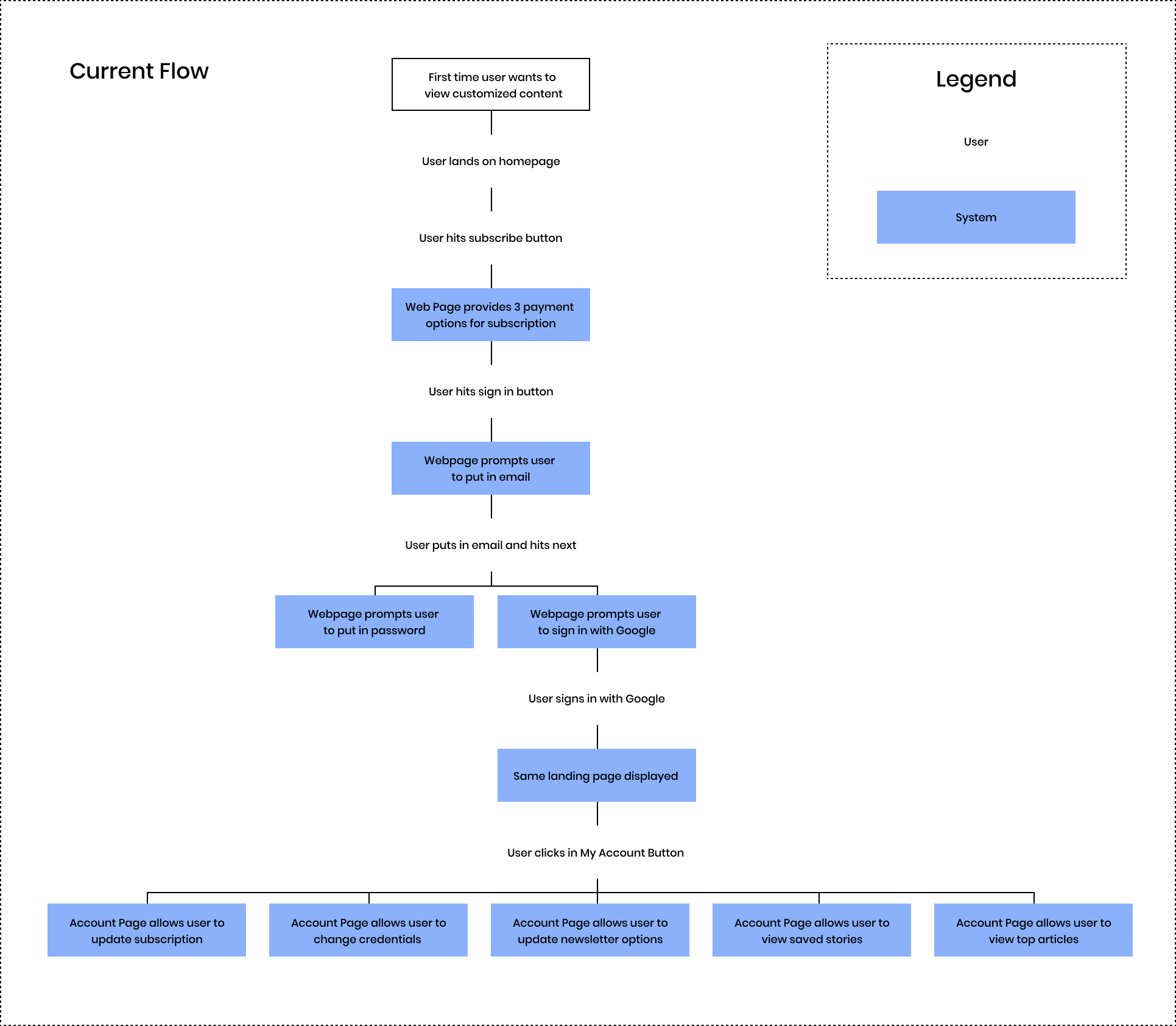
TASK ANALYSIS OF NEW SUBSCRIBER USE CASE
Design Goals
Based on my insights, I prioritized the following features for the redesign:
Personalization
Create an experience that tailors to the needs and interests of the reader through customization and personalization of content and content type.
Flash Reading
Create an experience that allows readers to digest content quickly and intermittently with the opportunity to dive deeper when they’d like.
Crowd-Powered Experience
Create an experience that is fueled by socialization. Allow readers to communicate with others in communities they feel inspired by.
Omnichannel Experience
Bring content to the reader by blending the content into their daily experiences. They may cross platforms and digital domains.
Novel Interactions
Create an experience that incorporates new ways to delight the reader through visual intrigue and interesting ways to interact.
Intriguing Visuals
Preserve and enhance the iconic beauty of the New Yorker’s illustrated content. Keep inspiration and information at the core of visual content.
Key Concepts
After mind mapping new ideas, I narrowed down to four concepts. I sketched each idea in a figurative space and shared them with four people for feedback.
Personalization Page
Readers can set up their profile page by choosing topics and genres that interest them. My assumption is that creating a personalized page will support the users' individual discovery experiences by bringing curated content to them. This concept can also help train the algorithms to enable the other chosen concepts.
☀︎Feedback
Overall, people appreciated this idea and felt it would help them discover content in their shorter allotted timeframes. A few were unsure as to whether this would derail the integrity of a tradional magazine.
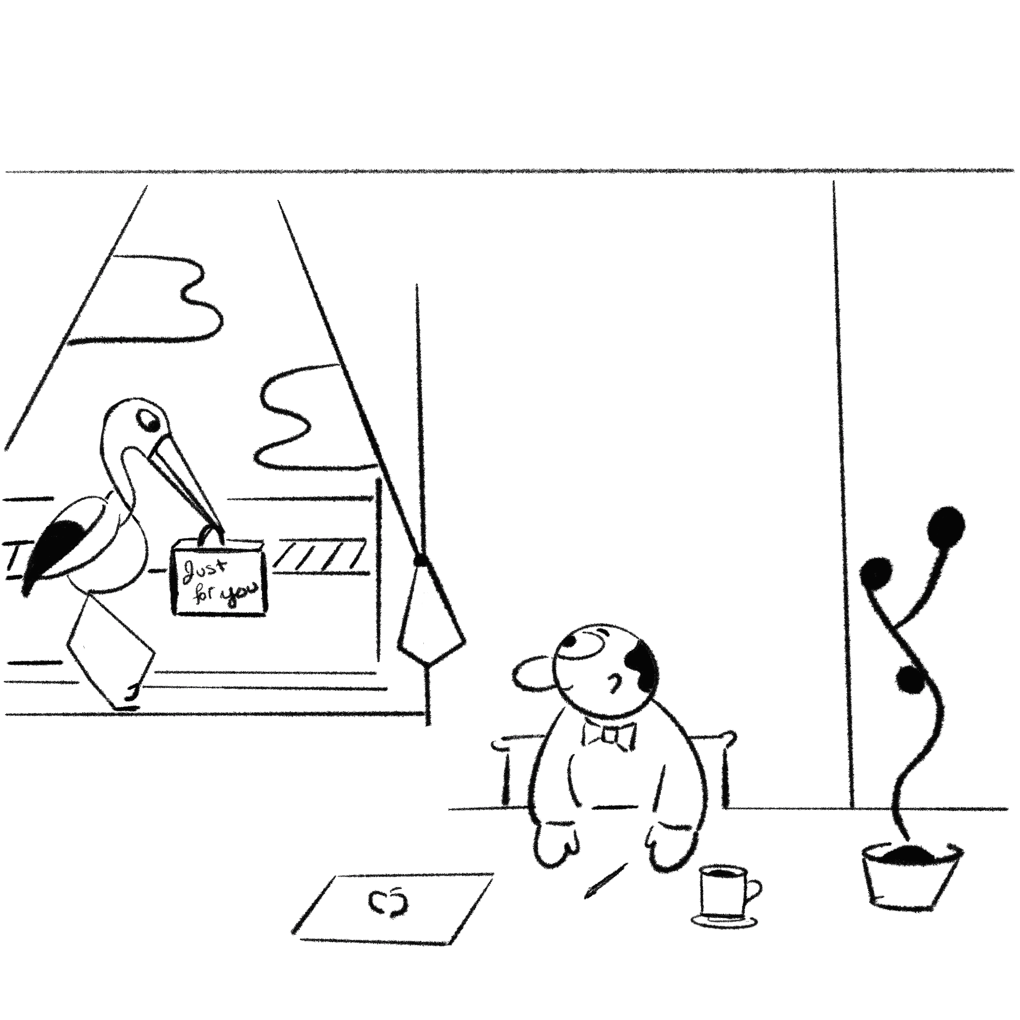
With Daily Delivered Content
Having a daily delivery package of content tailored to the interest of the reader is assumed to spark delight, trust, and intrigue. In addition, the metaphor behind personalized package delivery will likely help the user feel they are a valued member of the New Yorker community.
☀︎ Feedback
Participants generally thought this idea was very similar to the personalization page in terms of value, and were unsure of what it would add.
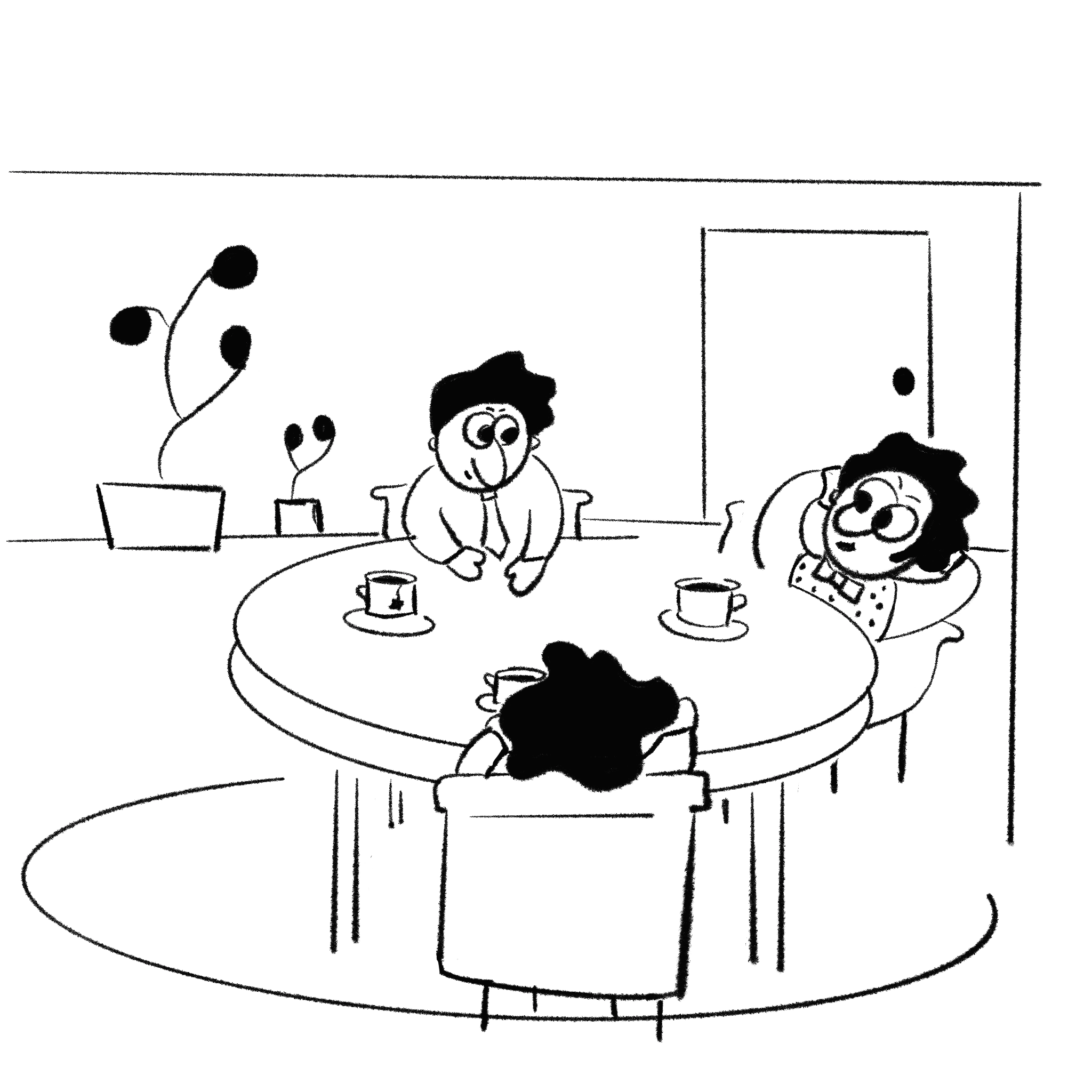
Along With A Daily Social
Readers can opt into the Daily Social Room and discuss content in a live audio discussion. The hypothesis is this will help users connect to a community that supports their interests.
☀︎ Feedback
People were most excited about this idea, as they felt its a way to make friends and strengthen their involvement in topics that interest them.
And A Weekly Data Portrait
Readers can log into their account and see a unique data visualization summarizing their reading habits, interests, and pairings with other subscribers.
☀︎ Feedback
People felt this was the most unique idea and that it can help them realize their interests. They found value in seeing other people’s interests but not their reading habits in data portraits.
It became clear that the personalization and community features were valued the most and echoed the niche and social needs identified in earlier research. I attempted to strategize how these features could be housed within the web-based magazine. I learned after several task flow iterations, that this was not directly feasible. It was better to make these features subscription based.
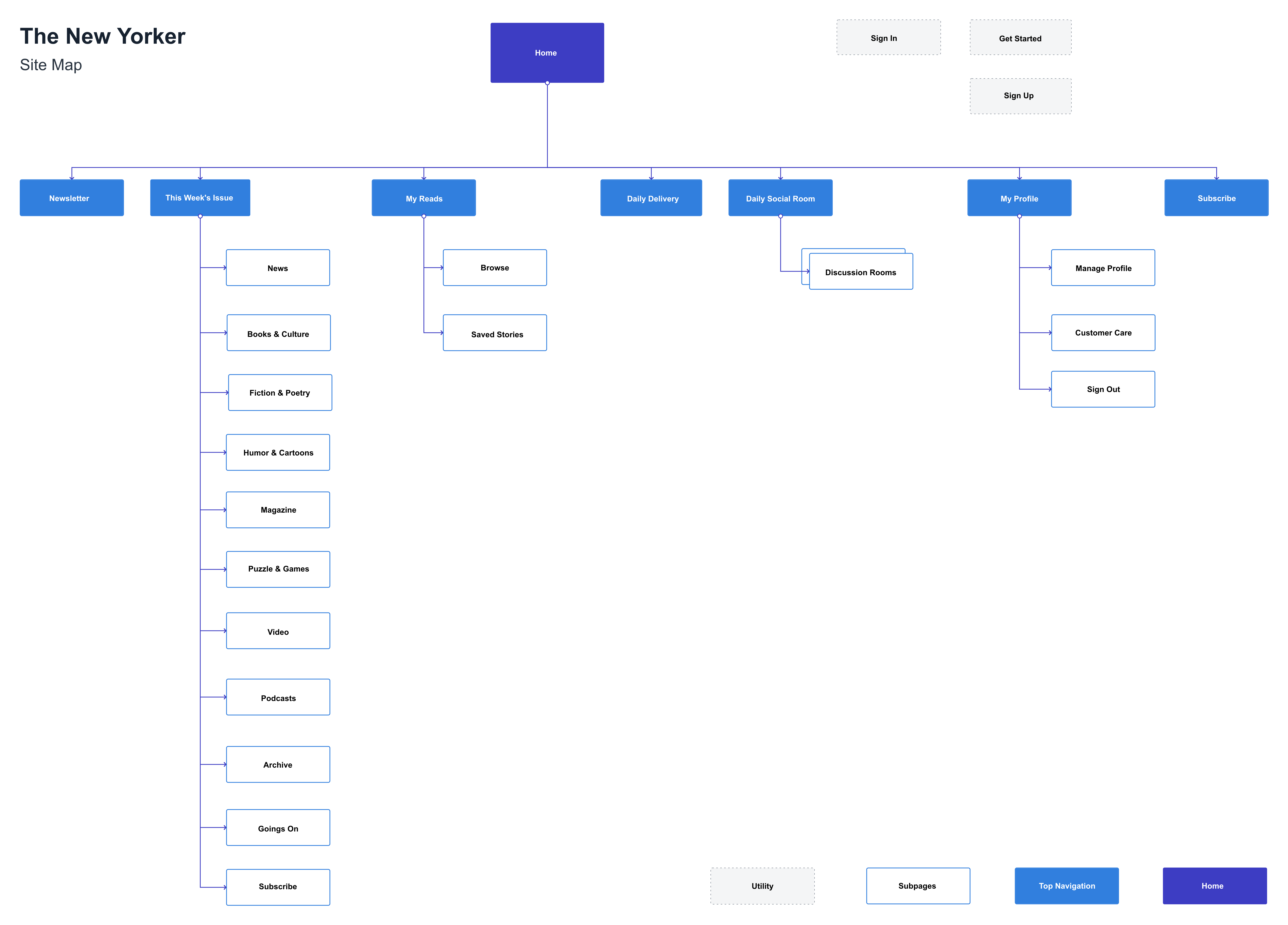
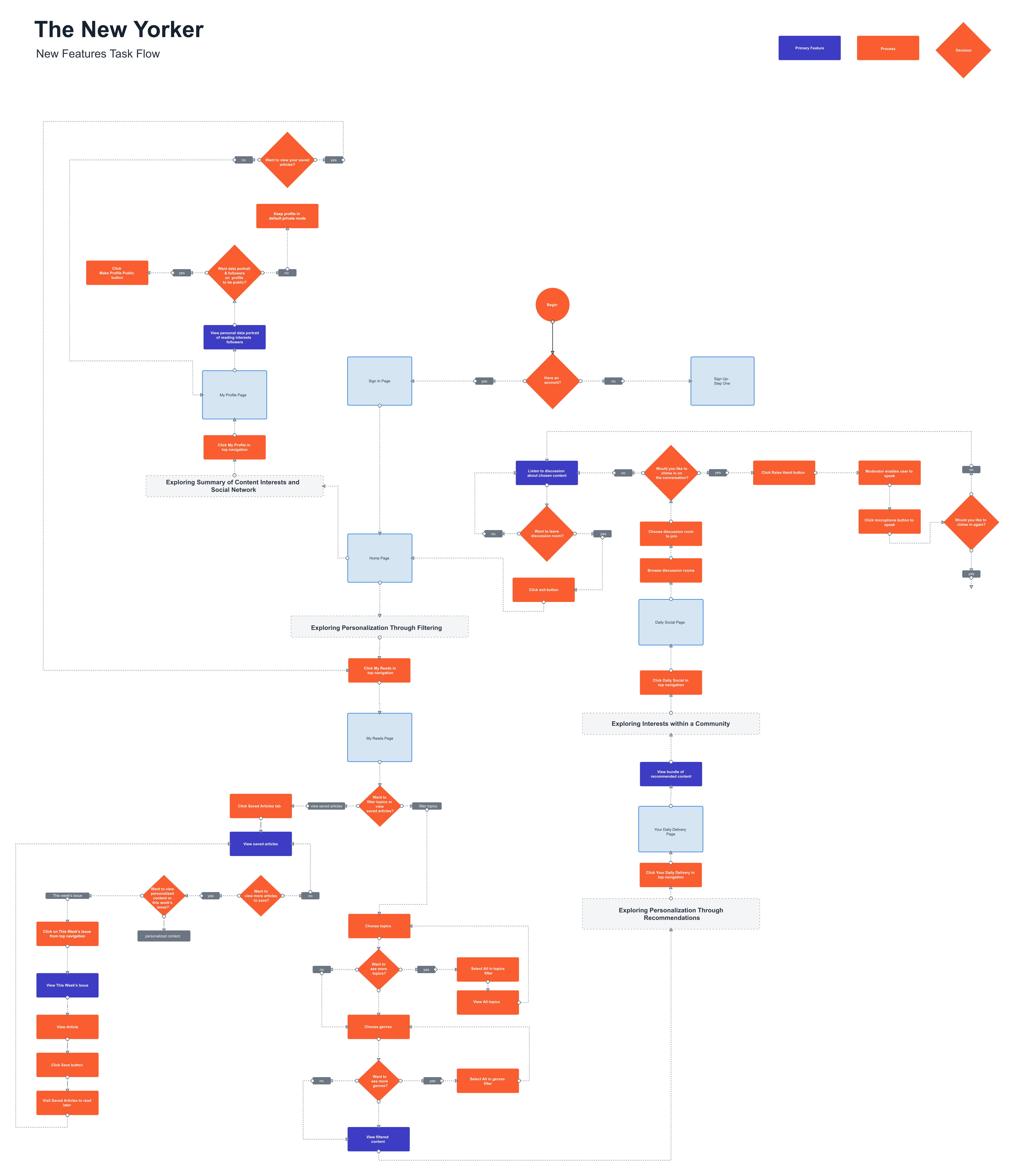
A SAMPLE OF AN EARLY TASK FLOW AND SITE MAP
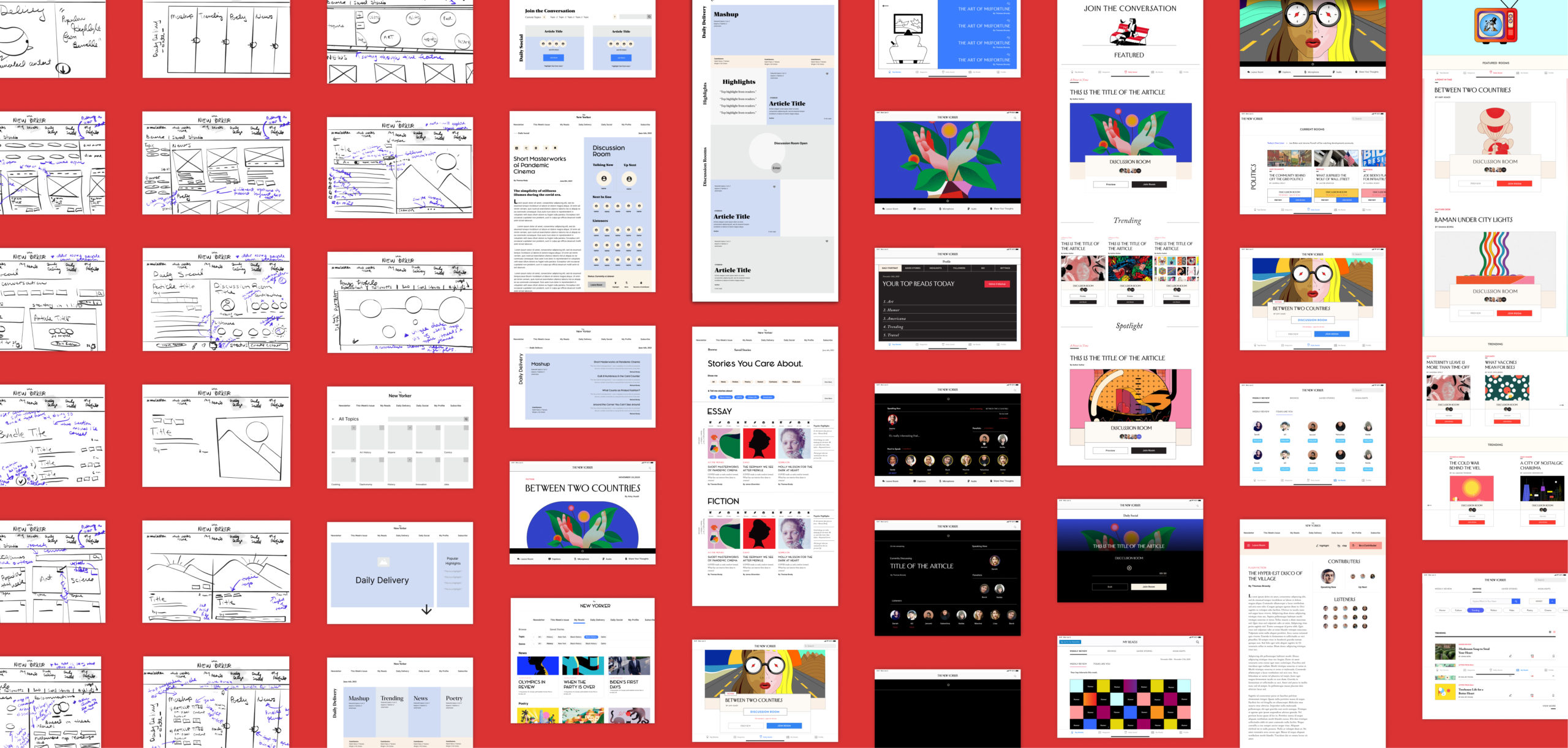
Design Explorations & Iterations
Later I went through rounds of screen-based iterations and user testing. Each round exposed flaws that resulted in key design decisions such as:
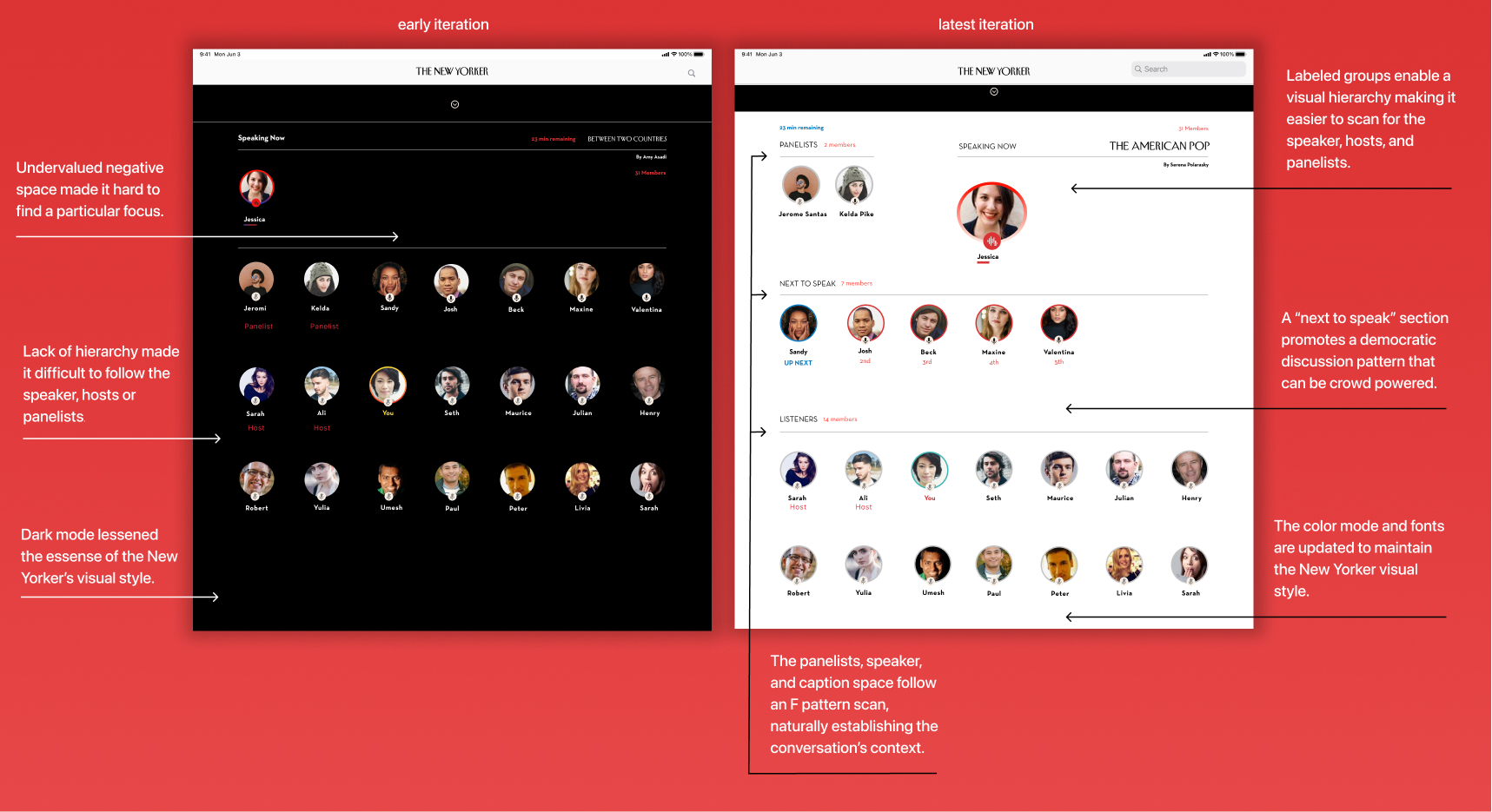
Daily social discussion rooms lacked hierarchy.
Participants were confused about who was speaking. I established a better visual hierarchy between the current speaker, the panelists, those up next to speak and listeners through visual weight and proximity.
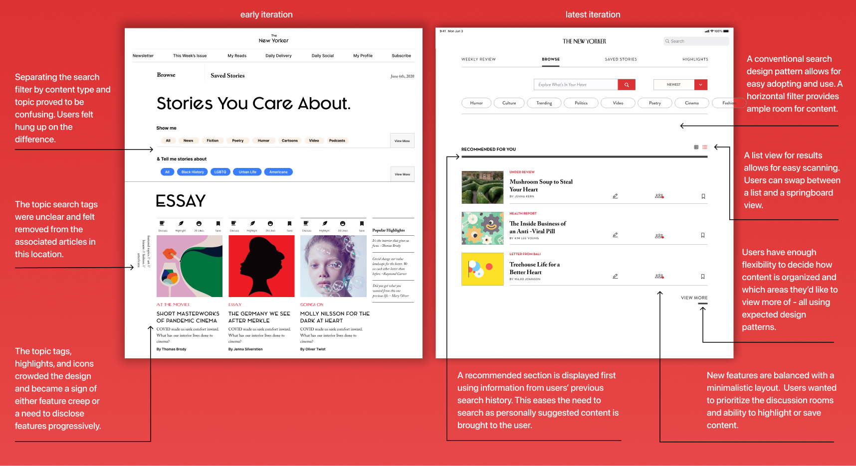
The search feature was
more intricate than needed.
Lastly, previous search iterations proved cumbersome and confusing. Testers got hung up on the difference between top and genre definitions rather than simply searching. I removed this concept and simplified it to a simple search with suggested categories based on previous searches.
Reflections
I learned how to find balance between two seemingly conflicting yet essential requirements.
What was exciting about this project was problem solving within two polar requirements - traditional versus novel reading experiences. Learning how to balance and interweave both within an existing platform was difficult yet rewarding. I learned how to implement this balance from a product strategy, interaction and visual design perspective. I found all are connected and influence one another.
More Projects 💌
Cool SchoolEducation Technology | Game Design
ElioProduct Design | Illustration
PlayARInclusive Design | Augmented Reality
There's always a good time for coffee talk. ☕️
I am currently seeking full-time or contract opportunities.
Feel free to reach out to say hello: amy.n.asadi@gmail.com
Or connect on: Linkedin.
© 2022 Amy Asadi